Introduction
Running a single gym means keeping an eye on memberships, ad spend, and revenue in one place. Running five gyms across five different cities means keeping an eye on all of that, five times over – while also trying to answer questions that span every location at once, like “which channel is actually bringing in members, not just leads?”
To make that possible, we built a FitZone Gym | Marketing and Revenue report in Google Looker Studio – a three-page dashboard that blends ad performance, website traffic, and revenue data for a fictional five-location gym chain into one interactive view.
This blog covers the problem the report solves, the dataset behind it, how the report is structured, the charts used to visualize the data, and how the filtering system ties it all together.
View the live report here: View Live Report
Problem Statement
Before a report like this exists, a multi-location fitness business runs into a familiar set of gaps:
- Marketing and revenue live apart – ad spend and campaign data sit in one system, membership and revenue data sit in another, so nobody can see spend and its actual payoff side by side
- No cross-location comparison – without a shared view, comparing Surat against Mumbai or Ahmedabad means pulling separate reports for each city and lining them up manually.
- Channel performance is opaque – Google Ads, Instagram Ads, and Meta Ads all report differently, making it hard to tell which channel is genuinely efficient versus which one just spends the most.
- Growth and churn are disconnected from marketing – new member sign-ups and cancellations are tracked separately from the campaigns that are supposed to be driving them, so retention never gets weighed against acquisition cost.
The result is a business that’s collecting plenty of data but struggling to turn it into a single, trustworthy view of what’s working.
The Solution
The FitZone Gym report solves this by blending four data sources into one Looker Studio dashboard, organized around three focused pages:
- A Marketing and Revenue Overview page for the big-picture numbers.
- A Channel Performance Deep Dive page for evaluating Google Ads, Instagram Ads, and Meta Ads side by side.
- A Revenue and Performance page that connects revenue to membership growth and retention.
- Shared filters (date range, gym name, channel) available on every page, so the same question can be asked at the whole-chain level or narrowed to a single gym or channel in a couple of clicks.
Together, these give anyone – from a marketing manager to a gym owner – one place to see spend, traffic, revenue, and membership health without switching tools.
About the Dataset
The report runs on a blended dataset covering five FitZone locations – Navsari, Surat, Vadodara, Ahmedabad, and Mumbai – across Gujarat and Maharashtra, spanning the full 2025 calendar year (January 1 – December 31). It’s built from four linked tables:
- Gym Locations – 5 records with city, state, capacity, manager, and monthly rent for each gym.
- Ad Performance – 16,425 daily records of impressions, clicks, spend, leads, conversions, CTR, CPC, and CPA, broken down by gym, channel, campaign, campaign objective, and device.
- Revenue Data – 7,300 daily records of revenue by category (Membership Fees, Personal Training, Group Classes, Merchandise & Supplements), along with new and cancelled members per gym per day.
- Website Traffic – 9,125 daily records of sessions, new users, bounce rate, and average session duration by traffic source (Google Ads, Instagram Ads, Meta Ads, Google Organic, and Direct).
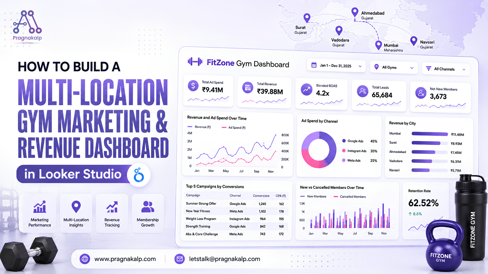
Advertising runs across three paid channels – Google Ads, Instagram Ads, and Meta Ads – with campaigns tagged by objective (Brand Awareness, Lead Generation, Traffic, Conversions) and by device (Mobile, Desktop, Tablet). Across the year, the chain spent ₹9.41M in ad spend to generate ₹39.88M in revenue – a 4.2x blended ROAS – while bringing in 65,684 leads and a net 3,673 new members, against 2,202 cancellations, for an approximate 62.52% retention rate.
Report Workflow and Pages
The report is organized to move from a chain-wide summary down to the two things that matter most: channel efficiency and revenue health.
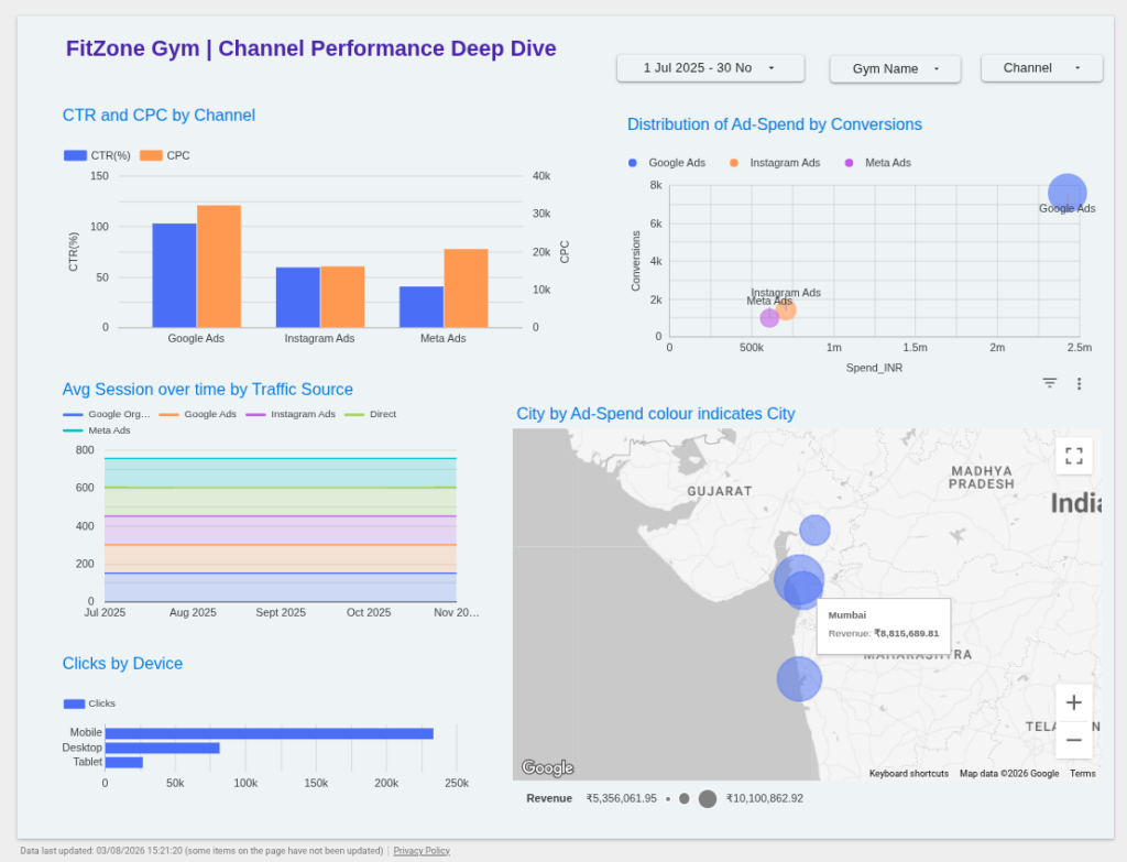
1. Marketing and Revenue Overview – The landing page shows the headline numbers for the whole chain: Total Ad Spend, Total Revenue, Blended ROAS, Total Leads, and Net New Members. Below that sits a combined revenue-and-spend trend over time, a breakdown of ad spend by channel, a revenue-by-city comparison, and a table of the top 5 campaigns by conversions. This is the page to open first for “how is the business doing?”
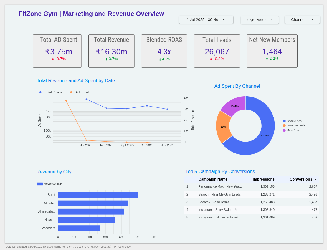
2. Channel Performance Deep Dive – This page exists to answer “which channel is actually worth the spend?” It compares CTR and CPC across Google Ads, Instagram Ads, and Meta Ads, plots ad spend against conversions per channel, tracks average session duration over time by traffic source, breaks down clicks by device, and maps ad spend by city.
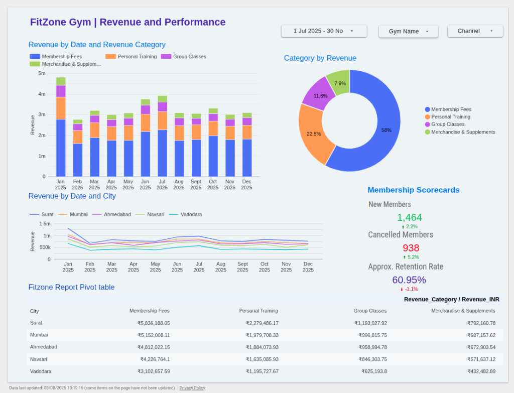
3. Revenue and Performance – This page connects marketing back to the business outcome that matters most: membership. It shows revenue by date split across revenue categories, a category-by-revenue breakdown, revenue by date and city, membership scorecards for new members, cancelled members, and retention rate, and a pivot table crossing city against revenue category.
Moving through the three pages in order – overview, channel, revenue – mirrors how a manager would naturally investigate a question: start broad, narrow to the channel driving (or wasting) spend, then confirm whether it’s actually translating into paying, staying members.
1.Revenue & Performance
2. Channel Performance Deep Dive
3. Marketing & Revenue Overview.
Charts Used in the Report
Each page uses chart types chosen for the specific comparison it needs to support:
- Scorecards (KPI tiles) – Total Ad Spent, Total Revenue, Blended ROAS, Total Leads, Net New Members, Cancelled Members, and Retention Rate are all shown as scorecards. Their specialty is giving an instant read on the chain’s health without requiring any interpretation.
- Dual-axis combo chart – “Total Revenue and Ad Spent by Date” plots two very differently scaled metrics (spend in thousands, revenue in millions) on separate axes over the same timeline. Its specialty is showing whether spend and revenue are moving together or diverging, which a single-axis chart would distort.
- Donut chart – “Ad Spent by Channel” and “Category by Revenue” both use donuts with percentage labels. Their specialty is showing how a total splits across a small number of categories at a glance.
- Horizontal bar chart – “Revenue by City” and “CTR and CPC by Channel” use bars to rank locations and channels against each other. Their specialty is making the top and bottom performers immediately obvious.
- Bubble/scatter chart – “Distribution of Ad-Spend by Conversions” plots each channel’s spend against its conversions, with bubble size indicating scale. Its specialty is showing efficiency, not just volume – a channel that spends more isn’t necessarily the one converting best.
- Line chart – “Avg Session Duration over Time by Traffic Source” and “Revenue by Date and City” track multiple series over the year. Their specialty is revealing trends and seasonality that a single end-of-year number would hide.
- Geo map – “City by Ad-Spend” plots spend geographically by location. Its specialty is making regional concentration visible in a way a table of city names can’t.
- Stacked bar chart – “Revenue by Date and Revenue_Category” shows monthly revenue broken into its four categories. Its specialty is showing both the total and the mix at the same time.
- Data table / pivot table – The Top 5 Campaigns table and the City × Revenue Category pivot table exist for precision. Their specialty is surfacing exact figures once a chart has pointed to where to look.
Filtration
All three pages share the same filter bar, so a filter chosen once carries across the whole report:
1. Date range – narrows every chart and table to a specific period, such as a single quarter or month.
2. Gym Name – isolates one location, letting a manager see exactly how their gym is performing on every page without affecting the others’ data.
3. Channel – focuses the report on a single advertising channel, useful for evaluating a Google Ads, Instagram Ads, or Meta Ads campaign in isolation.
Because these filters apply globally rather than per-chart, a gym owner can, for example, select “FitZone Surat” once and instantly see that gym’s spend, channel mix, and revenue and membership performance across all three pages – no re-filtering required on each one.
The Marketing and Revenue Overview page, with the global filter bar highlighted for first-time users.
Conclusion
By blending ad performance, website traffic, and revenue data for five gym locations into one Looker Studio report with a shared filter bar, the FitZone Gym dashboard turns three previously disconnected data sources into a single view of what’s actually driving membership growth. A manager can start on the Overview page for the chain-wide picture, move to the Channel Performance page to see which platform is genuinely efficient, and finish on the Revenue and Performance page to confirm whether that spend is converting into members who stay.
The same three-layer pattern – chain-wide overview, channel or segment deep dive, and outcome/retention page – extends naturally beyond gyms, to any multi-location or multi-channel business that needs to connect marketing spend to the metric that actually matters: customers who stick around.