Introduction
Marketing teams today run campaigns across multiple platforms – Google Ads, Meta Ads, TikTok Ads, and more and each platform comes with its own dashboard, its own metrics naming, and its own export format. Making sense of performance across all of them usually means jumping between tabs, exporting spreadsheets, and manually reconciling numbers before anyone can answer a simple question like “which platform is actually driving the best ROAS this quarter?”
To solve this, we built a consolidated Digital Ads Performance Report in Google Looker Studio that brings Google Ads, Meta Ads, and TikTok Ads data into a single, filterable, multi-page dashboard.
To solve this, we built a consolidated Digital Ads Performance Report in Google Looker Studio that brings Google Ads, Meta Ads, and TikTok Ads data into a single, filterable, multi-page dashboard-an approach that can also be extended through marketing reporting automation.
This blog walks through the problem we set out to solve, the dataset behind the report, how the report is structured page by page, and how the filtering system lets users slice the data however they need.
View the live report here: View Live Report
Problem Statement
Before this report existed, evaluating ad performance involved a few recurring pain points:
- Fragmented data – impressions, clicks, spend, and revenue lived in separate platform dashboards with no unified view
- Inconsistent metrics – each platform calculates and labels things like CPC, CPA, and ROAS slightly differently, making side-by-side comparison difficult
- No single source of truth – stakeholders had to trust manually compiled spreadsheets that were often out of date by the time they were reviewed
- Limited slicing – answering a question like “how did the SaaS industry perform on TikTok last quarter?” required custom pulls rather than a quick filter.
In short, there was no single place to see the full picture of ad spend and return across platforms, campaigns, and industries.
The Solution
The Digital Ads Performance report addresses this by combining all platform data into one Looker Studio dashboard with:
- A consolidated Overview page that rolls up performance across all platforms.
- Dedicated platform pages (Meta Ads, Google Ads, TikTok Ads) for deeper, platform-specific analysis.
- A consistent metric layout – impressions, clicks, conversions, CTR, ad spend, CPC, CPA, and ROAS – used identically on every page, so numbers are always comparable.
- Global filters (date range, platform, campaign, industry) that let anyone reshape the view in a couple of clicks instead of requesting a new export.
The result is a report that any stakeholder – marketing, finance, or leadership – can open and get a trustworthy read on performance in minutes.
About the Dataset
The report is built on a blended ad-performance dataset spanning three platforms: Google Ads, Meta Ads, and TikTok Ads. It contains 1,800 daily records covering the full 2024 calendar year (January 1 – December 30), with each row capturing performance for a specific date, platform, campaign type, industry, and country.
Every record includes the following dimensions and metrics:
- Dimensions – date, platform, campaign type, industry, and country
- Funnel metrics – impressions, clicks, and CTR
- Cost metrics – ad spend and CPC
- Outcome metrics – conversions and CPA
- Monetization metrics – revenue and ROAS
Campaigns are grouped into four standard types – Search, Video, Shopping, and Display – and tagged by industry (Healthcare, EdTech, SaaS, Fintech, and E-commerce) and by country across seven markets (USA, UK, Germany, UAE, India, Canada, and Australia), which is what powers the industry-level breakdowns on each platform page. Google Ads accounts for 720 of the records, Meta Ads for 630, and TikTok Ads for 450, reflecting each platform’s campaign volume over the year. Overall, the dataset totals 185.3M impressions, 7.1M clicks, and ₹11.11M in ad spend, generating 326.8K conversions and ₹54.2M in revenue at a blended 4.9x ROAS.
Report Workflow and Pages
The report follows a simple top-down workflow: start broad on the Overview page, then drill into a specific platform for detail.
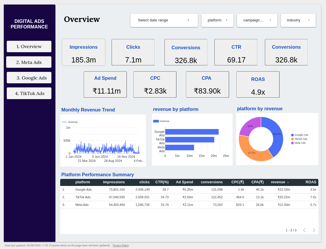
- Overview – The landing page rolls up all three platforms into one set of headline KPIs (impressions, clicks, conversions, CTR, ad spend, CPC, CPA, ROAS), a monthly revenue trend, a revenue-by-platform comparison, and a platform performance summary table. This is the fastest way to answer “how are we doing overall?”
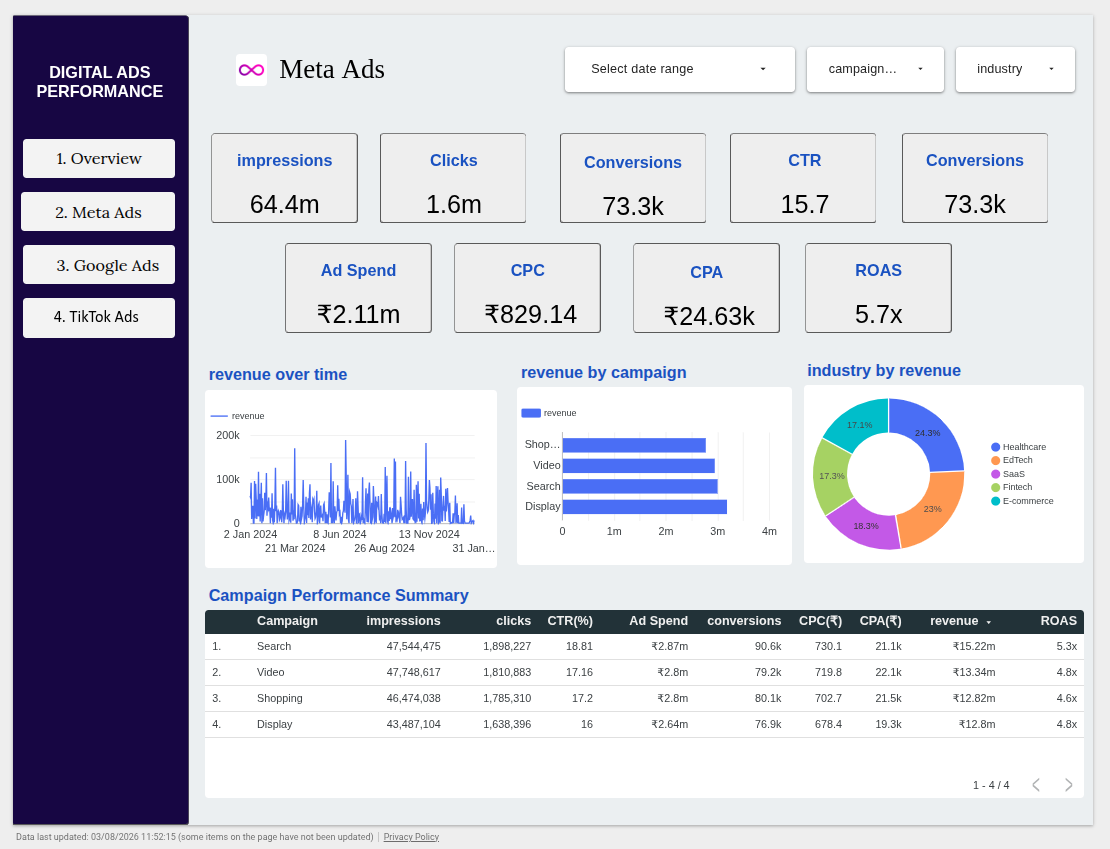
- Meta Ads – Breaks down Meta-specific performance by campaign type (Search, Video, Shopping, Display) and by industry, alongside a revenue-over-time trend and a full campaign performance table.
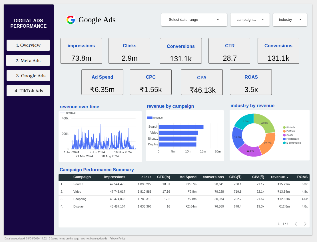
- Google Ads – Mirrors the same layout as the Meta Ads page, but scoped to Google’s campaign and industry data, making it easy to compare structure-for-structure against Meta.
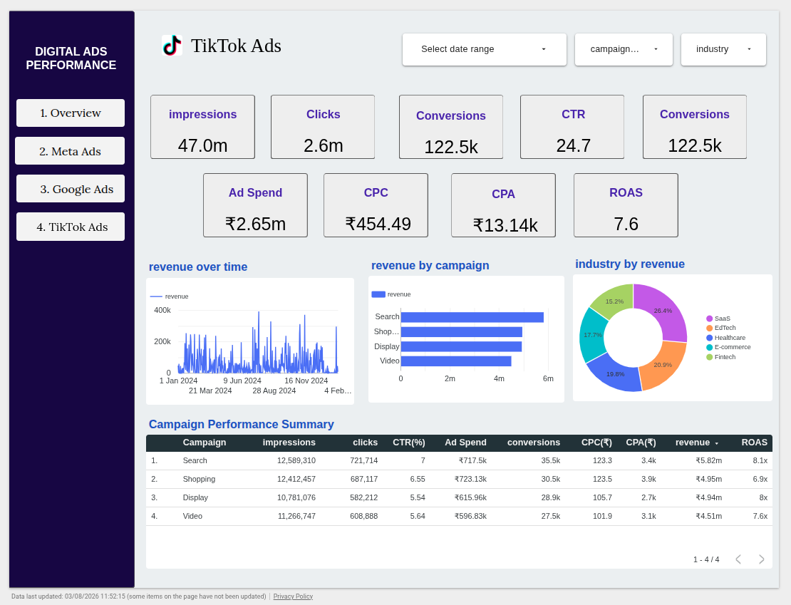
- TikTok Ads – Completes the set with TikTok’s own campaign and industry breakdown, using the identical chart and table layout as the other two platform pages.
Keeping every platform page in the same visual format was a deliberate design choice – it means a viewer who understands the Meta Ads page already knows how to read the Google Ads and TikTok Ads pages without any extra explanation.
1.overview page
2. Meta Ads page
3. Google Ads Page
4. Tok-Tok Ads Page
Charts Used in the Report
Every page pairs a handful of chart types with the specific job each is best at, rather than defaulting to one visual for everything:
- Scorecards (KPI tiles) – Impressions, Clicks, Conversions, CTR, Ad Spend, CPC, CPA, and ROAS are shown as scorecards at the top of every page. Their specialty is speed: a single glance gives the headline number without needing to interpret a chart.
- Time series (line chart) – The Monthly Revenue Trend on Overview and the “revenue over time” chart on each platform page plot daily revenue. Their specialty is spotting trends, spikes, and dips over time that a static number would hide.
- Bar chart – “Revenue by platform” (Overview) and “revenue by campaign” (platform pages) use horizontal bars. Their specialty is ranking – it’s immediately clear which platform or campaign type is generating the most revenue relative to the others.
- Donut chart – “Platform by revenue” (Overview) and “industry by revenue” (platform pages) use a donut chart with percentage labels. Their specialty is showing share of the whole – how the revenue pie splits across platforms or industries at a glance.
- Data table (summary table) – The Platform Performance Summary and each Campaign Performance Summary table lay out every metric side by side per row. Their specialty is precision – when a viewer needs the exact figures behind a chart, the table is where they go.
This mix means every question a viewer might have – “what’s the number,” “is it trending up or down,” “who’s winning,” “what’s the split,” and “what are the exact figures” – has a chart built specifically to answer it, rather than forcing one chart type to do all five jobs.
Filtration
Every page in the report shares the same filter bar at the top, so filtering is consistent no matter where a user is:
- Date range – narrow the entire report to a specific time window.
- Platform – isolate one advertising platform (useful even on the Overview page).
- Campaign – focus on a single campaign type, such as Search or Shopping.
- Industry – view performance for one vertical, like Fintech or Healthcare, across all charts and tables on the page.
Because the filters apply globally to every chart and table on a page at once, users don’t need to adjust each visual individually – one selection reshapes the entire view instantly. This is what turns the report from a static summary into an interactive tool people actually explore, rather than just a snapshot to be re-exported every week.
The Overview page, with the global filter bar and page navigation highlighted for first-time users.
Conclusion
By blending Google Ads, Meta Ads, and TikTok Ads data into one Looker Studio report with a consistent page layout and a shared global filter bar, this dashboard replaces manual, platform-by-platform reporting with a single interactive source of truth. Anyone on the team can start at the Overview page for the big picture, drill into a specific platform, and filter by date, campaign, or industry to get exactly the view they need – no spreadsheet exports required.
The same approach – one overview page, consistent per-entity detail pages, and a shared filter bar – can be reused well beyond ad performance, for reporting on sales pipelines, product usage, or any other data that spans multiple sources but needs to be compared on equal footing.